I added a favicon
I didn't have a favicon before. Now I do! I want to share my thoughts behind its design, and how I have begun to find an identity with this domain name that started as a bit of a shit-post.
I didn't have a favicon before. Now I do! I want to share my thoughts behind its design, and how I have begun to find an identity with this domain name that started as a bit of a shit-post.
I bought this domain (veryth.ink) on a whim one day because it was something I thought was kind of clever at the time, and still do for the most part1. But until now, I hadn’t really identified with it in any meaningful way, it was/is a form of shit-post, which later was justified as a way to take myself and the publication of my thoughts a little less seriously, and now, spurred by the creation of this favicon, it’s a way of owning the way my brain works.
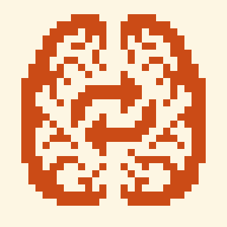
I had gotten tired of seeing the 404 error when my browser tried and failed to fetch the favicon for my website, so, I sat down and opened up my favorite pixel-art editor2. My immediate inclination was to draw a brain, it’s what I (and I hope, many others) use when thinking, very, or otherwise. But I didn’t want to just draw a brain and call it a day, that felt kind of lazy, and lacking any individuality or personal meaning. So I started to think about, well, how I think, specifically how difficult it can be sometimes to get the disparate parts of my brain to work together to achieve a common goal. The over-simplified model of “left-brain vs right-brain” sprung to mind, and I knew I had to somehow communicate the two halves working together in this icon. After a few iterations, I came up with this!

I used the common “repeat” symbol, that anyone who has used a music player since the 2000’s should recognize, as a reference for the symbol in the midst of the two hemispheres to indicate cycles, or iterations, of thought. This can sometimes be a negative state of operation for me, where I fixate on something out of my control and sink deeper into anxiety, but other times, this fixation can be one of my strengths! This was all the justification I needed to commit to this logo, and in doing so, it helped me finally build a story for this domain name that is consistent with an aspect of my identity.
I hope you enjoyed reading this little bite-size post on the motivations behind the design of my new favicon. If any of this resonated with you in some way I’d love to hear how! You can find out how to contact me on my about page. Or, if you’re here from RC, well, you know how to find me!